


Alternate Futures Brand Guide
The visual identity system for the decentralized cloud


This is the visual identity reference for all Alternate Futures properties. Every public-facing design, from documentation and marketing to social media, pitch materials, and product UI, follows these specifications.

Color Palette
The AF palette is a carefully calibrated system of 7 colors. Brand Blue is the dominant identity color and should appear on every composition. The remaining colors serve specific functional and emotional roles.
Primary Colors
Secondary Colors
Color Combinations
These are the approved color pairings. Every design should use one of these combinations as its foundation.
Default pages are Dark Blue #0000AF headings on Cream #F9F5EE, with body text in #1A1A1A. Body text uses that one near-black value everywhere on light surfaces. Dark Blue is for headings, emphasis blocks, and backgrounds, never body text.
CSS Variables Reference
Use these variables in all web properties:
:root {
  /* Primary */
  --af-brand-blue: #000AFF;
  --af-dark-blue: #0000AF;
  --af-terracotta: #BE4200;

  /* Secondary */
  --af-cream: #F9F5EE;
  --af-medium-blue: #A5B2FF;
  --af-apricot: #FFC7AA;
  --af-sky: #C8E0E4;

  /* Hover states */
  --af-brand-blue-hover: #0008CC;
  --af-brand-blue-pressed: #0006A6;

  /* HSL equivalents */
  --af-brand-blue-hsl: 238, 100%, 50%;
  --af-dark-blue-hsl: 240, 100%, 34%;
  --af-medium-blue-hsl: 231, 100%, 82%;
  --af-terracotta-hsl: 21, 100%, 37%;
}Do NOT use #0026FF (hue 231). Brand Blue #000AFF sits at hue 238. The 7-degree shift toward azure is visible and off-brand. Always verify the hex value when implementing.

Typography
The AF type system uses three typefaces, each with a distinct role. Consistency in font usage is critical to brand recognition.
Instrument Sans -- Primary
The workhorse typeface. Used for all body text, headings, navigation, buttons, and UI elements.
Weights: Display, H1, and H2 are Bold 700. H3 and H4 are SemiBold 600. Body text is Regular 400. Medium 500 is for UI labels and buttons.
Usage: All headings (h1-h6), body paragraphs, navigation items, button labels, form fields, table text, sidebar content, breadcrumbs.
Import: Already loaded via Adobe Typekit (use.typekit.net/qqp2xqh.css)
Instrument Serif -- Accent
The elegant contrast. Used sparingly for taglines, pull quotes, and italic emphasis to add sophistication.
Usage: Hero taglines, blockquotes, pull quotes, sidebar section titles, testimonial attribution. Never use for body text or UI elements.
Import: Google Fonts (family=Instrument+Serif:ital@0;1)
JetBrains Mono -- Code
The developer typeface. Every code block, inline code reference, terminal output, and technical specification uses JetBrains Mono.
accessTokenService: new PersonalAccessTokenService({
personalAccessToken: process.env.AF_TOKEN,
}),
});
Usage: Code blocks, inline code, terminal commands, API references, file paths, hex values, technical labels.
Import: Google Fonts (family=JetBrains+Mono:wght@400;500;600;700)
Type Scale
The size scale used across all AF properties. Sizes shown in rem relative to a 16px base.
Geometric Elements
The AF geometric system is the visual language that makes our brand unmistakable. Stars, circles, rings, and waves are used as decorative elements across all materials. The master SVG library contains 124 geometric assets (plus 2 logo files) in 7 brand colors at 4 sizes. This site serves a 38-asset subset from public/brand/; the samples below come from that subset.
Stars
Four-pointed stars represent discovery, achievement, and the expansive nature of decentralized infrastructure. Scatter 3-5 stars per composition at mixed sizes. Never center them symmetrically.
brand-blue

terracotta
apricot
off-white

medium-blue

sky

dark-blue

brand-blue

terracotta

apricot

brand-blue

brand-blue
Circles
Solid filled circles represent completeness, ROI, and unity. Use for bullet markers, data points, and small decorative fills.
brand-blue

sky

apricot

brand-blue

sky

brand-blue
brand-blue
Rings
Open rings (stroke-only circles) represent networks, connections, and decentralized infrastructure. Use for corner decorations and network visualizations.

brand-blue

apricot

brand-blue

medium-blue
brand-blue

terracotta

brand-blue
Waves
Full-width wave shapes serve as section dividers, footer decorations, and background textures. The master library has every wave at solid, 10%, 20%, and 30% opacity in all 7 brand colors.




Decorative Compositions
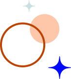
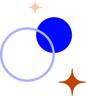
Pre-composed groups of stars, circles, and rings for use as hero decorations and section accents. Three color temperature variants: brand (blue-dominant), cool (blue + sky), and warm (terracotta + apricot). The brand and warm variants both contain Terracotta, so in product UI use the cool variant only.


Element Usage Rules
| Rule | Description |
|---|---|
| Max 2 element types | Never use more than 2 geometric types (e.g., stars + rings) in a single composition |
| Asymmetric placement | Stars must be scattered asymmetrically. Never center or arrange them in a grid |
| 3-5 stars per composition | Mix sizes (S + M, or S + L). Never use all the same size |
| Rings in corners | Rings work best as corner decorations, partially cropped by the frame |
| Waves as dividers | Waves always span the full width. Use 10% opacity for subtle, solid for strong |
| Circles as accents | Small circles for bullet points and data markers. Never as primary decoration |
| Terracotta shapes | Terracotta stars, rings, waves, and the brand / warm compositions are for marketing materials (site, decks, social, print, campaigns) only. Product UI (app, dashboard, docs UI) never uses Terracotta decoratively |
| Opacity range | Decorative elements at 6-30% opacity on light backgrounds. 8-20% on dark backgrounds |
Logo Usage
The AF logo exists in two forms: the logomark ("AF" monogram) and the wordmark (full "Alternate Futures" text). When we say "the logo", we mean the full wordmark. The source SVGs (/logo.svg, /wordmark.svg) fill with var(--fill-0, #000000). Black is only a fallback, not a logo color, so always set the fill to the approved logo color for the background (see Approved Backgrounds below).
Logo Variants
Clear Space
The minimum clear space around the logo is equal to the height of the "F" in the logomark. No text, images, or other design elements should intrude into this space.
Minimum Size
The logo is at least 280px wide. Wherever the full wordmark is "the logo" (site headers, decks, documents, social cards, partner pages), render it at 280px wide or larger. Never squish it to fit a smaller slot.
Where 280px won't fit, use the AF logomark instead. Navigation bars, favicons, avatars, app chrome, and other tight spaces get the logomark, not a shrunken wordmark.
Legibility floors. These are technical limits, not targets. Below them, the letterforms become illegible:
- Logomark: never below 24px wide (digital), 10mm (print)
- Wordmark: never below 120px wide (digital), 40mm (print)
Approved Backgrounds
The logo may be placed on:
| Background | Logo Color | Notes |
|---|---|---|
Cream #F9F5EE | Brand Blue #000AFF | Default / primary usage |
White #FFFFFF | Brand Blue #000AFF | Acceptable for partner co-branding. Never as a page background |
Brand Blue #000AFF | White #FFFFFF | Hero sections, branded materials |
Dark Blue #0000AF | White #FFFFFF | Dark mode, footer |
Black #0A0A0A | White #FFFFFF | Dark mode only |
- Never apply drop shadows, glows, outlines, or bevels to the logo
- Never rotate, skew, stretch, or compress the logo
- Never place the logo on busy photographic backgrounds
- Never change the logo colors to non-brand colors
- Never rearrange or separate the "A" and "F" letterforms
- Never use the old
#0026FFcolor in the logo
Brand Voice & Tone
The AF brand voice is how we sound in every written communication -- docs, blog posts, social media, support conversations, and investor materials. It should feel like a conversation with a technically brilliant friend who respects your time.
Voice Traits
Tone Spectrum
The same voice can shift tone depending on context:
| Context | Tone | Example |
|---|---|---|
| Documentation | Instructional, precise, neutral | "Run acc services deploy to deploy your service. The CLI follows the deployment and prints your service URL when it is live." |
| Blog posts | Conversational, informative | "We shipped a big update this week -- here is what changed and why it matters for your workflow." |
| Error messages | Helpful, never blaming | "Deployment failed: the build command exited with code 1. Check your package.json scripts." |
| Social media | Energetic, concise | "Cheaper than Vercel. Same deploy flow. Your margins intact." (No percentages or other numeric claims.) |
| Investor materials | Confident, sourced | "[Metric] went from [X] to [Y] between [date] and [date] (source: [system of record])." (Illustrative. Never invent or overstate figures for buyers or investors.) |
| Community/Discord | Casual, supportive | "Good question! That is a known issue in v0.9.2 -- here is the workaround until the fix ships." |
Terminology
Always use these standard terms. The company is Alternate Futures (then "AF"). The product is Clouds by Alternate Futures on first or formal mention, then "Clouds".
| Term | Usage | Avoid |
|---|---|---|
| Alternate Futures | Full company name (first mention in any document) | "Alt Futures", "AltFut", "A.F." |
| AF | Acceptable abbreviation after first mention | Any other abbreviation |
| Clouds by Alternate Futures | Full product name (first or formal mention) | "Alternate Clouds" (former product name, retired 2026-09-29), "AF Cloud" |
| Clouds | Product name after first mention | "Alternate Clouds", "the AF cloud" |
acc | The Clouds CLI, published on npm as @alternatefutures/acc (e.g. acc services deploy) | af (old binary name), @alternatefutures/cli (abandoned package) |
| Market-capture claims | Banned phrase. Never use, in any context | "AF captured the vacuum" (unsupported market-capture claim) |
| deploy | Lowercase verb for the deployment action | "push", "ship", "launch" (in technical docs) |
| site | A static website deployment | "app" (when referring to static hosting) |
| function | A serverless cloud function | "lambda", "endpoint" |
| agent | An AI agent deployment | "bot", "model" (when referring to hosted agents) |
| decentralized | Preferred. Describes the infrastructure model | "distributed" (unless technically accurate) |
Do's and Don'ts
Color Usage
#000AFF as the primary accent on every page and composition. It is the anchor of the visual system.#0026FF, #0000FF, or any other blue as a substitute. #0026FF sits at hue 231, 7 degrees off Brand Blue's 238. The shift is visible and off-brand.#F9F5EE as the light mode background. The warm tone is a core part of the brand identity.#FFFFFF as a page background. It looks sterile and clashes with the warm palette. White is only for card surfaces on Cream, text on dark surfaces, and as a co-branding logo background.#1A1A1A on light surfaces. Use Dark Blue #0000AF for headings, emphasis blocks, and backgrounds.#333 or #0A0A0A. There is one body text color.Typography
font-feature-settings: 'liga' 1, 'calt' 1) for enhanced readability.Geometric Elements
/brand/ directory). These are precision-crafted to the brand specifications.Voice and Content
Photography and Imagery
Dark Mode
Dark mode is not an inversion -- it is an adaptation. The brand guidelines specify Dark Blue #0000AF as the immersive background color. For extended reading (documentation), we use near-black #0A0A0A for reduced eye strain, reserving Dark Blue for footer, hero, and emphasis sections.
Dark Mode Palette
| Role | Light Mode | Dark Mode |
|---|---|---|
| Page background | Cream #F9F5EE | Near-black #0A0A0A |
| Card/surface background | White #FFFFFF (cards on Cream only) | Dark surface #141414 |
| Primary interactive | Brand Blue #000AFF | Medium Blue #A5B2FF |
| Primary hover | #0008CC | #B8C3FF |
| Alert (warnings, urgency, cost) | Terracotta #BE4200 | Apricot #FFC7AA text and borders; Terracotta #BE4200 fills |
| Warm accent (non-alert) | Apricot #FFC7AA | Apricot #FFC7AA |
| Footer / emphasis bg | Brand Blue #000AFF | Dark Blue #0000AF |
| Headings | Dark Blue #0000AF or #1A1A1A | Cream #F9F5EE |
| Body text | Near-black #1A1A1A | Cream #F9F5EE |
| Geometric elements | Brand Blue at 6-30% opacity. Terracotta shapes in marketing materials only, never in product UI | Off-White or Medium Blue at 8-20% opacity. Terracotta shapes in marketing materials only, never in product UI |
Dark Mode Geometric Elements
All geometric brand elements need dark mode variants:
| Light Mode Asset | Dark Mode Treatment |
|---|---|
star-*-brand-blue.svg | Use star-*-off-white.svg or filter: brightness(3) |
ring-*-brand-blue.svg | Apply filter: brightness(3) saturate(0.5) |
wave-brand-blue-*.svg | Use wave-off-white-*.svg |
decorative-*-brand.svg | Use decorative-*-cool.svg or apply filter: brightness(2) |
Asset Library
Full SVG Inventory
The master brand asset library contains 124 geometric SVGs plus 2 logos (126 files), organized by type. This docs site ships a 38-asset subset in public/brand/ (14 stars, 7 circles, 7 rings, 6 waves, 4 decorative groups).
| Category | Count | Sizes | Colors |
|---|---|---|---|
| Stars | 28 | S (24px), M (48px), L (96px), XL (144px) | 7 brand colors |
| Circles | 28 | S (24px), M (48px), L (96px), XL (144px) | 7 brand colors |
| Rings | 28 | S (24px), M (48px), L (96px), XL (144px) | 7 brand colors |
| Waves | 28 | Full-width (1920px) | 7 colors x (solid + 10% + 20% + 30% opacity) |
| Decorative Groups | 12 | S, M, L, XL | brand, cool, warm variants |
| Logos | 2 | Logomark (35x32), Wordmark (600x139) | Fill via var(--fill-0) (falls back to black; always set it) |
| Total | 124 + 2 logos = 126 |
File Naming Convention
{type}-{size}-{color}.svgWhere:
- type:
star,circle,ring,wave,decorative - size:
small,medium,large,xl - color:
brand-blue,dark-blue,medium-blue,terracotta,apricot,sky,off-white - opacity suffix (waves only):
-10,-20,-30(omit for solid)
Examples: star-small-brand-blue.svg, wave-terracotta-20.svg, decorative-large-warm.svg (the last two are in the master library only)
Source of Truth
- Figma file: AF-Branding-2026
- SVG source directory (master library):
admin/docs/pitch-deck/assets/ - Docs public assets (38-asset subset):
public/brand/
Quick Reference
Brand Compliance Checklist
Use this checklist before publishing any external-facing material:
- Color check: Only palette colors used? Brand Blue
#000AFFpresent? Body text in#1A1A1A? Terracotta only for alerts (plus decorative geometry in marketing materials)? - Typography check: Instrument Sans for body/headings? Display/H1/H2 at 700, H3/H4 at 600, body at 400? Instrument Serif for accents only? JetBrains Mono for code?
- Element check: Geometric elements from approved SVG library only? Max 2 types per composition?
- Logo check: Full wordmark at least 280px wide, or the logomark where it won't fit? Correct clear space? Correct color on correct background? No modifications?
- Tone check: Developer-to-developer voice? Technical but accessible? Honest about limitations? Every number cited and dated?
- Naming check: "Clouds by Alternate Futures" on first mention, then "Clouds"? No "Alternate Clouds"? CLI commands use
acc? - Partner check: Akash, IPFS, Filecoin, Arweave, ICP positioned positively?
- Dark mode check: Medium Blue for primary interactive? Off-white geometric elements? Proper contrast ratios?
CSS Import Snippet
For any new web property, include these imports:
<!-- Instrument Sans (Adobe Typekit) -->
<link rel="stylesheet" href="https://use.typekit.net/qqp2xqh.css" />

<!-- Instrument Serif + JetBrains Mono (Google Fonts) -->
<link rel="preconnect" href="https://fonts.googleapis.com" />
<link rel="preconnect" href="https://fonts.gstatic.com" crossorigin />
<link rel="stylesheet"
  href="https://fonts.googleapis.com/css2?family=Instrument+Serif:ital@0;1&family=JetBrains+Mono:wght@400;500;600;700&display=swap" />
Contact
Brand questions and compliance reviews go to Amy Lynn Taylor, Founding Product Designer.